A New Way of Donating To Conservation
With conservation funding declining, the United States has been scrambling to find a new way to keep our conservation programs healthy and strong. With a fresh outlook on the way individuals donate, I set out to give the outdoor community a more modern and flexible way to help preserve our natural spaces, using only their phone.


The Problem
How can we improve conservation funding?
Goals
-
Create a simple and modern way to improve conservation funding
-
Connect different groups and subcultures that have interests in conservation
-
Put everything onto one platform
My Role

Discovery
Before we could dive into solving these problems, first we needed to have a more thorough understanding of conservation in North America.

The North American Model of Conservation
From the Beginning, hunting and fishing was the foundation of conservation funding in the United States and Canada. All money spent on tags and licenses went straight back into wildlife conservation funding ($796 million annually). Not too much later, hunters once again stepped to the plate and willingly added the Pittman-Robertson tax, which was an 11% tax on all hunting and fishing equipment that also goes straight back into conservation ($371 million annually). This Model was extremely successful and responsible for the rehabilitation of the declining number of species due to market hunting.
More information about The North American Model of Conservation
So what's changed?
Hunting participation has been on a steady decline since the 80’s. Considering about 60% of conservation funding comes from hunting, this loss of active hunters has left a void in conservation funds. This does not mean that the younger generations are not into the outdoors, though.
In fact, the number of visits to national parks has increased greatly over the years.
Interviews
Getting started with user interviews, it was important that we find an audience who would be considered "outdoor enthusiasts"
Qualifications:
-
Regularly participates in outdoor activities
-
Has volunteered or donated to conservation groups
-
Has a good understanding of conservation
The findings from my user interviews proved to be invaluable to this project and helped set the stage for where this project would lead.
Key Insights
-
Current forms of donating are complex and dated “yesterday's technology being used today”
-
Donating needs to be flexible
-
The social side of the outdoor community is important. “Conservation is about building a community around shared spaces and values”
-
“Money is easier” in references to donating vs. volunteering
-
How is success being defined in conservation? Users want positive feedback from conservation groups, this level of communication is important.

Personas
After conducting user interviews, I wanted to create three personas to represent our target users. I created these personas directly based off of the findings from my user interviews and regularly referenced these during my design process to ensure I was keeping a “user first” mentality.

Staying on Track
I used a How Might We and Jobs To Be Done framework to organize and narrow our goals after the information we gained from user interviews.

Ideation
After brainstorming possible solutions, I narrowed it down to three possible ideas to build from.
-
A platform that allows users to donate small amounts (or however much they wanted) to a large, specific goal by a conservation group.
-
A round-up app, similar to Acorns, that allows users to donate spare change to whatever conservation groups they chose.
-
A “wish list” platform for conservation groups to post their needs for specific projects such as items, tools, volunteers, money, etc to get a task done. Allowing the user to see exactly where their efforts would be going ahead of time.
Ultimately I decided to go with option two, the round up app. I chose this idea to build from because it checks all the boxes for what we need. It allows flexibility and convenience, since the user will be able to donate spare change and also will function as a “set and forget” app. It would also allow us to add other features for our secondary needs such as news, volunteering, educating, and social interaction.
User Stories and Sitemap
Before diving into sketching, I wanted to get user stories and a sitemap together. The user stories allowed me narrow down what my MVP needed to contain. You will also see my original sitemap, which changed multiple times throughout my design process. This map laid the foundation for what my sketches were going to look like.

After organizing the information from the user stories, I broke them down into four categories, with the two strongest categories being Donations to conservation groups and Feedback / news from conservation groups.

Original sitemap

Sketching
and Mockups
I put the information I gathered from all my research to work by doing some simple sketches of what my red route screens would possibly look like. I then followed up with low fidelity prototype testing to validate my decisions. Using Marvel, I created a clickable version of these screens and tested it on 5 new people.
Testing Insights
-
Add bank information during the onboarding phase
-
Educate the user early on about the round up donation system
-
Users want “news” section to be customizable
This first round of testing can be viewed as a proof of concept for the main goals of this app. My biggest takeaway, though, was that the more the tester had to use their imagination with these rough sketches, the more distracted they were from giving uninterrupted feedback.

Mid-fidelity wireframes came next, which was the perfect way for me to start experimenting with the mental model I had for this app. It allowed me to test out more realistic page layouts, imagery for the app, color schemes, and other UI elements. A few key features within the wireframes are:
-
Add a conservation group to your round up donation list
-
Attend events hosted by conservation groups
-
See news posted directly from conservation groups
-
See other users attending events/supporting conservation groups

Branding
I put together a mood board to help represent the feelings of the targeted users. Along with this I added reasoning behind the imagery and examples that I chose and connections to the brand personality of my app.

Brand Platform
Moving forward I needed to create a brand platform to build the foundation of how users view Bivvy and what they associate us with. Being a financial app that acts as a “middle man” between users that donate and also the conservation groups that receive these, this was very important.
Company/Product Name:
-
Bivvy
-
I chose this name because Bivvy is a helpful item used outdoors that is both functional and extremely lightweight/portable. It's not as much of a burden as other similar items and is used for many different types of outdoor activities.
-
Mission/Vision:
-
We want to make donating and contributing to our beloved outdoor spaces easier and more flexible. Anyone and everyone can be part of positive change in their own personal way.
-
With wild spaces disappearing and being destroyed at a rapid pace, it's important that we can all contribute in our own way. This brand is here to not only help raise more money for conservation groups, but to educate and bring people together in a positive way.
-
Brand Personality:
-
Bivvy wants to motivate and inspire users to be more involved in positive change in an innovative and creative way.
Brand Attributes
-
Trustworthy, flexible, sincere, positive, welcoming.
-
With Bivvy acting as a middle man between users' donations and conservation groups, trust is something we must reiterate and make a very prominent part of our image. Creating a welcoming and positive environment will allow us to show users that Bivvy has a sincere mission of positive change while allowing them to be part of this change with flexibility in mind.
-
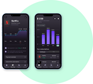
High Fidelity Mockups
Now that we have the look of the Bivvy app locked in, it was time to make a more polished version of the app. I made these screens based around a few major tasks users would be completing.
-
Sign up / Add bank information
-
Add a conservation group to your round up donation list
-
Attend an event

Testing
I used Figma to animate a clickable prototype once my high fidelity screens were completed. I did two rounds of usability testing, using 5 new people for each round.
Findings from round one
Issue #1 - Educating the user
Once again they had questions about the way the round up system worked, this time with more specific details such as “what exactly will the app be rounding up to?” This was the most serious issue I ran into and knew it needed to be addressed first, so I added splash screens in the beginning of the signup process to respond to this

Issue #2 - Re-working the iconography
Throughout testing I received mixed responses to the iconography, but from the beginning I felt like the icons felt too heavy. I needed to select some with a lighter line weight and also make a few of them a little more obvious.
Before After

Issue #3 - Add bulleted information on conservation group profile page
This issue was minor, but an easy and necessary adjustment. Throughout usability testing, almost every person said they appreciated the bulleted information on the events pages. Mentioning that it was easy to scan the information and gather quickly. This made me realize that the users were taking a bit longer to gather the information on the conservation group profile pages, so I decided to put key information in a bulleted format.
Before After

The changes for these were implemented followed by a second round of usability testing. The educational splash screens made a huge difference and received great feedback. Altering the icons and the additional bullet points on the conservation profile page also had a positive reaction from the testers.
UI and Style Guide
The style guide was made to set standards and constraints for the platform. It is meant to make sure that the app continues to have a consistent feel and look, even with new additions possibly added in the future or other members of the team working on it.
When I was initially choosing my color palette, I wanted to use orange as my call to action color with a deep blue as my secondary color. After a few mockups I ultimately decided against this because of one main issue; orange does not feel charitable. Green did a much better job creating a charitable feel, while also allowing me to keep my color palette simple. This was important because I wanted my CTA color to have a big impact when used and not lose its purpose of drawing the users attention.


While designing my logo I decided to change the original look to a more simplified design so that it was more legible at a smaller scale.
Before After

Takeaways
The design process of the Bivvy app provided valuable lessons and insights. Selecting the right people to interview during my research phase was responsible for putting the project on the right path while using techniques, like user personas and stories, kept it there. Moving forward there are a few other concepts and additions I believe should be included.
-
Explain how Bivvy profits from these donations. It's important that we stay transparent and let the user know exactly how much of their donations are going to the conservation group
-
Make it more social. Many of the testers mentioned they would like a “lightweight” version of social media within Bivvy. Viewing other users profiles and messaging each other was a common response.
The overwhelmingly positive responses to this project showed that there is a real need for a more modern way to donate to conservation and connect with like minded people. Perfectly stated by Clint during my user interviews “These are our lands and it’s up to us to take care of them.”